singspiel font
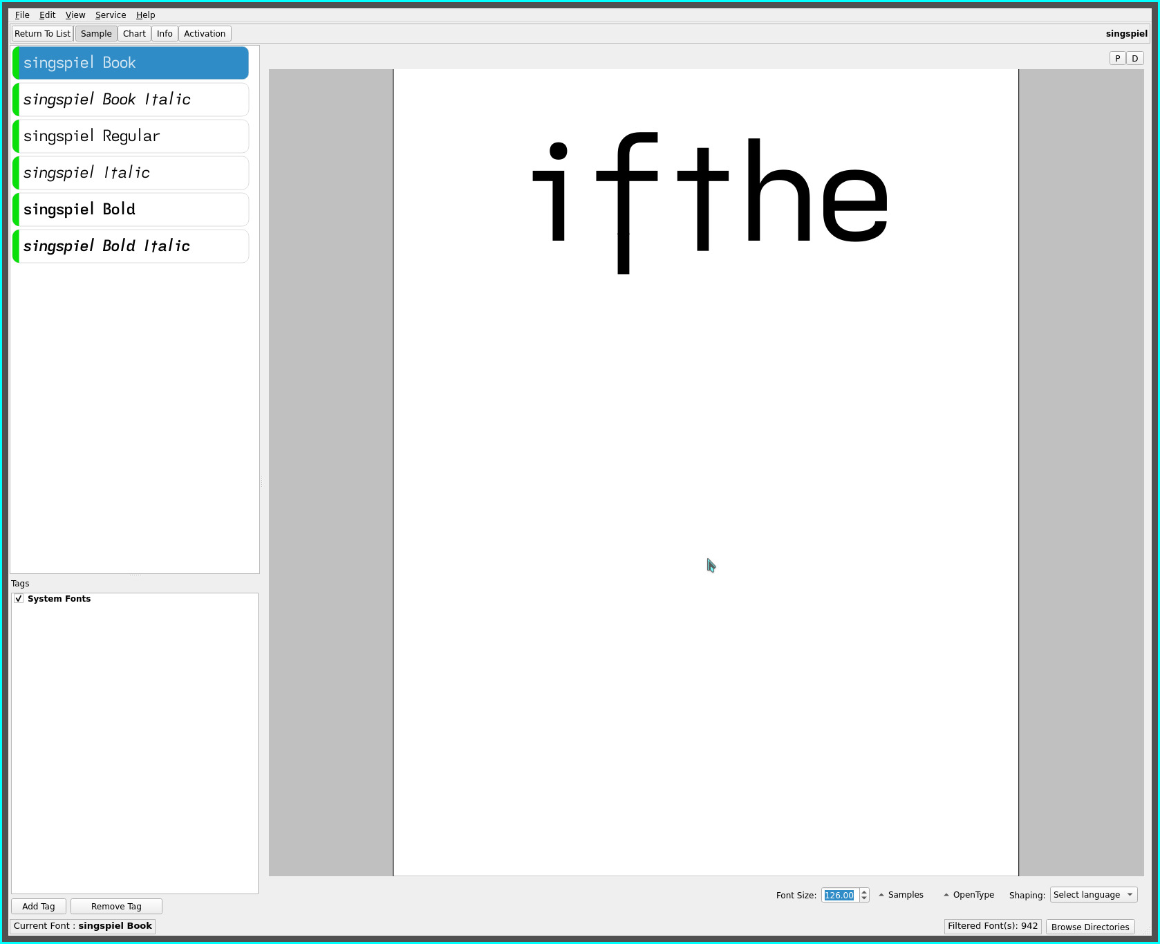
the singspiel font marks a visual departure from the font series released on this site with the re-introduction of the familiar lower case cross t.
For those unfamiliar with the dyslexic fonts from this site, some history..
asymmetric t
over the course of the past two years—has it been that long!—the reversed asymmetric lower case t became the uniquely defining glyph for the dyslexic font variants released since its inception.

Despite its unfamiliar glyph shape—doubly so, being not only asymmetric but reversed—the sweeping rise imparted by the right side stem next to adjacent cap height glyphs (notably, the high frequency th bigram) quickly established itself as part of the core set of standard dyslexic glyphs—both visually appealing (to these biased eyes), as well as, strikingly unique, a glyph reduced to its bare essence.
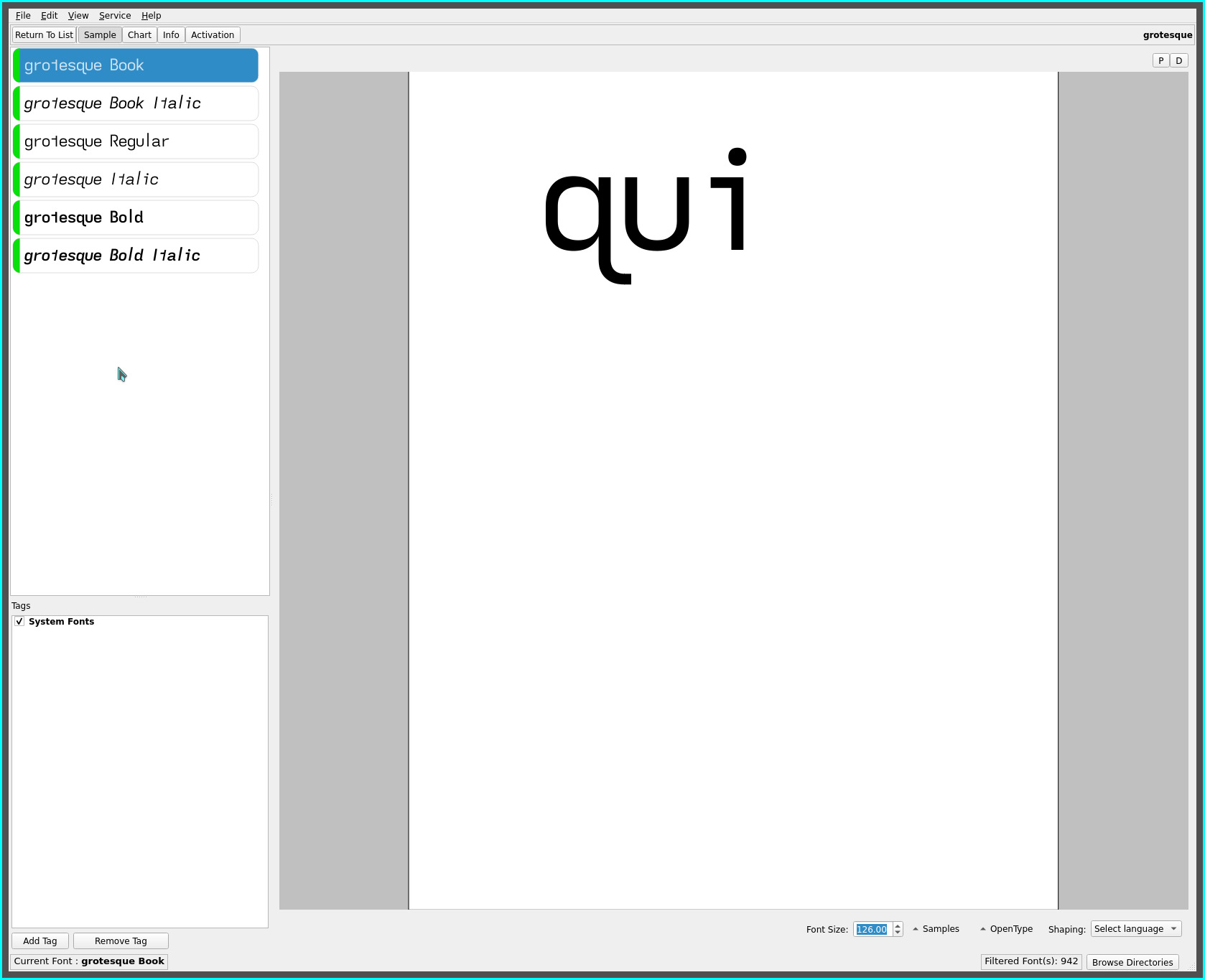
q hook
shortly after the grotesq font was introduced, the grotesque font was created with the hook of the lower case q significantly extended into the adjacent character cell, further distinguishing itself from the other non-mirrored lower case b d p glyphs..

The grotesque font quickly established itself as my default ereader font and all was well in font land :-)
cross t
forever exploring the “feel” typefaces impart to the visual experience of reading printed material, the q hook extension and the recently re-introduced (and modified) extended f led to revisiting the lack of a cross t glyph shape in the current font rotation.
Hence, it’s re-introduction, both as an homage to the Futura font and the fact that many (and anyone unfamiliar with the dyslexic font progression on this site) possibly find the reversed asymmetric t too radical a glyph shape to palate.
In the spirit of the asymmetric t’s uniqueness, enters the extended stem cross t to compliment the extended lower case f..

This glyph shape retains the sweeping rise produced by the reversed asymmetric t—created by the subtle descender which provides a visual riser to the following letter—whilst, along with the extended f, imparts a subtle “wave” like flow to the horizontal baseline and, importantly, a return the all familiar glyph shape.
singspiel
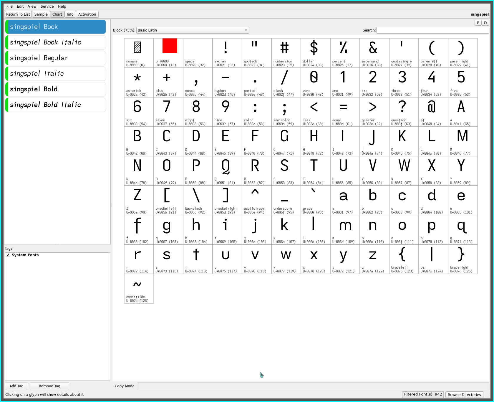
Despite only differing by a single glyph change from the grotesque font, the singspiel font flows with a subtle visual wavelike rhythm while managing to project an even cleaner geometric typeface (in part, i suspect, due to my fondness for the Futura font “look”).
This typeface also departs from past naming conventions in not containing the glyph of significance in its name—the first iterations of the typeface with the full y descender depth, felt like musical notation, hence, the reference to a musical term.

‧ ‧ • ‧ ‧
The reversed asymmetric t has been so predominant in my ereader usage the past two years, it has been surprising how readily these eyes have welcomed the return of the familiar cross t. The cap height stem length allows the glyph to be distinct without being visually intrusive—and feels more “balanced” for it—yet contributing to the font’s pleasant visual rhythm.
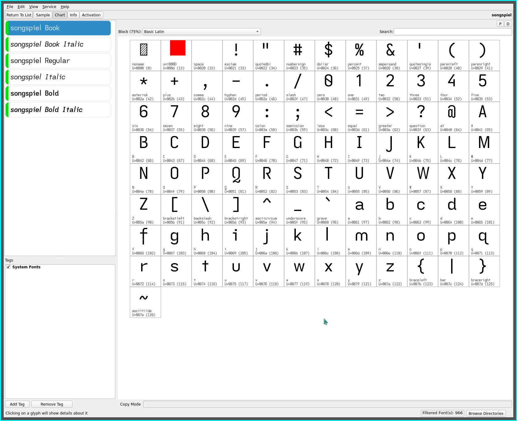
songspiel
For a slightly more traditional glyph set with a serifed capital I and non-extended cross t, is the songspiel font for contrast..

the singspiel and songspiel fonts are available in two l ascender heights. The samples above illustrate the “tall” stem extension above the cap height as when first introduced.
A variant of both fonts is also available with an extension closer the to the extended f height—it remains taller but visually renders to the eye as the same height as the extended f at the small font size (11.4pt) i read at.
For maximum readability, the “tall” stem will be preferred for the singspiel font, albeit, this is only of concern for words with a capital serifless I followed closely by a lower case l, such as, “I’ll”—whereas, the serifed capital I of the songspiel font avoids this issue.
The “tall” l ascender has a visual weight proportional to the extended f, whereas, the matching extended f height l renders a more subtle visual balance to the line (standing out less)—noticeable when switching quickly (with the grotesque font, in this case), less so, when simply reading. Six of one, half dozen of another, as the saying goes.
pseudo kerning
newly added to the latest repo uploads for the singspiel, songspiel, grotesque and groteske fonts are tightend serifless capital I (eye) and lower case l (el), and serifed lower case i and quotes.
This deviates from the “monospaced” emphasis of previously issued fonts with slightly narrower cell widths for the above glyphs imparting a more proportional font density.
The “monospaced” leaning former fonts may be preferred for dyslexia but this latest cell width adjustment should have a greater visual appeal and is not a drastic departure :-) To compensate for the increased visual letter density (of words), the space cell width has been increased from 0.875 to 0.915 monospaced cell width to further punctuate word clusters.
As always, YMMV.
repos
These fonts may be found on OneDrive.